
Blog
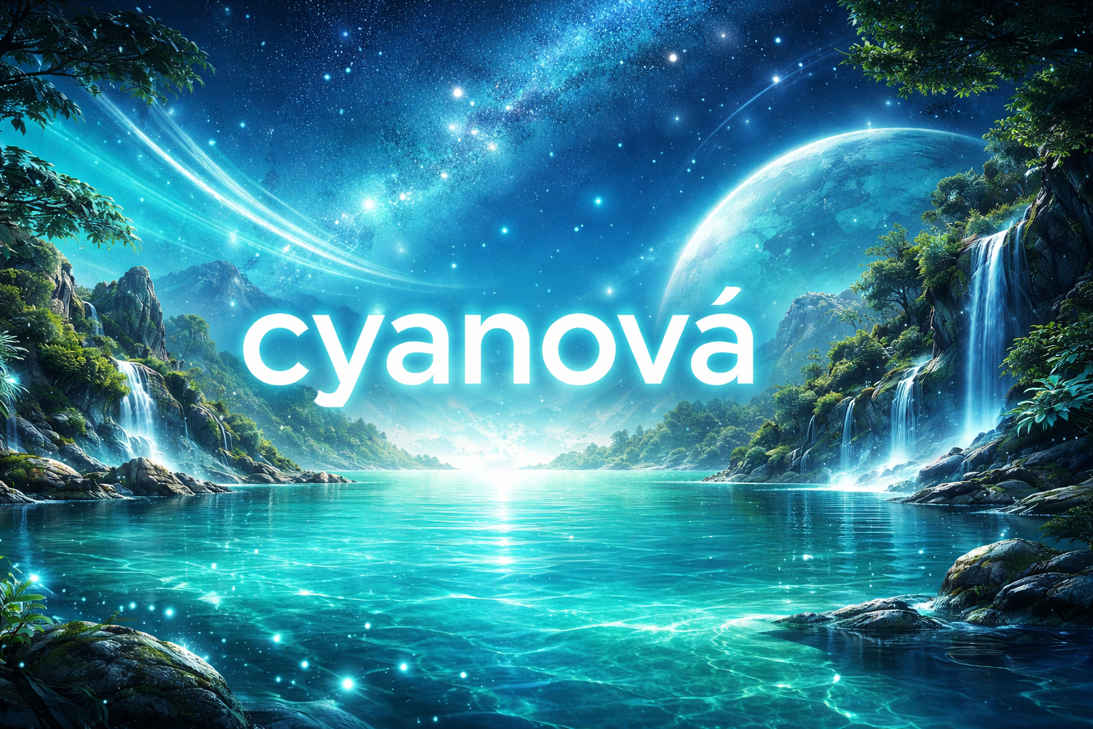
cyanová: The Hidden Power of the Blue-Green Spectrum Lights!
Introduction
Color has always shaped the way humans understand the world, but some shades carry a depth that goes far beyond decoration. Among them stands cyanová, a striking blue-green tone that quietly bridges science, art, emotion, and technology. It is a color that lives between extremes. Neither purely blue nor fully green, it occupies a fascinating middle ground that feels both calming and electric at once.
Across cultures and disciplines, cyanová appears in unexpected places: in digital screens, in marine waters, in architectural accents, and in advanced printing systems. It is not just a pigment or a visual sensation; it is a structural part of how modern imagery works. To understand cyanová is to understand how color behaves in light, in perception, and in culture. This article explores the meaning, science, evolution, and relevance of this compelling shade in a way that reveals why it holds such quiet influence in the contemporary visual world.
What Is cyanová
The term cyanová refers to the blue-green hue commonly known in English as cyan, expressed here in its feminine adjectival form used in several Central and Eastern European languages. It represents one of the primary subtractive colors in color printing and a key component of the RGB and CMYK color systems used in digital and physical media.
Scientifically, cyanová sits between blue and green on the visible light spectrum, with wavelengths typically around 485 to 495 nanometers. When light of this wavelength reaches the human eye, it stimulates both the blue and green photoreceptor cones, creating a blended perception that feels vibrant and luminous.
Unlike traditional blues that can appear heavy or cool, or greens that evoke earthiness, cyanová carries a kind of clarity. It often resembles tropical water under bright sunlight or the glow of a digital interface. This duality between nature and technology gives it a unique position in both visual culture and scientific application.
The Historical Roots of Blue-Green Pigments
Long before modern color theory formalized its identity, shades resembling cyanová appeared in natural mineral pigments. Ancient civilizations used crushed turquoise, malachite, and azurite to create blue-green tones in murals, jewelry, and ceremonial objects. Though they did not label the color with contemporary terminology, they clearly valued its luminous quality.
In Renaissance Europe, artists began experimenting with more refined pigment mixtures to capture sea tones and atmospheric depth. The subtle blending of blue and green allowed painters to depict water, distant mountains, and reflective skies with more realism. While the modern concept of cyanová would not emerge until color systems were scientifically organized, the visual presence of this hue had already been woven into artistic tradition.
The industrial revolution marked a turning point. Synthetic pigments became more reliable and affordable, making blue-green shades widely accessible. As printing technology advanced in the nineteenth century, cyan became a standardized color component in four-color printing processes. This transformation elevated cyanová from an artistic nuance to a foundational technical element.
The Science Behind the Color
Understanding cyanová requires a closer look at how human vision processes color. The retina contains three primary types of cone cells that respond to short, medium, and long wavelengths of light. When both the short and medium wavelength cones are stimulated simultaneously, the brain interprets the combination as a blue-green hue.
In additive color systems like RGB, cyan appears when green and blue light are combined at full intensity without red. On digital screens, this combination generates the bright, almost glowing effect often associated with modern design aesthetics. In subtractive systems such as CMYK printing, cyan acts as a primary ink that absorbs red light while reflecting green and blue. This scientific role makes cyanová essential for reproducing accurate photographic images.
Another lesser-known aspect involves color temperature and contrast. Cyanová often appears cooler than pure green but more dynamic than deep blue. Designers exploit this balance to create visual tension or to guide the viewer’s attention subtly across an image or interface.
cyanová in Art and Visual Expression
Artists often gravitate toward colors that hold emotional complexity, and cyanová is rich in expressive potential. In abstract painting, it can symbolize clarity, renewal, and introspection. In contemporary digital art, it frequently appears in futuristic themes, representing innovation or virtual reality environments.
Because cyanová lies between two dominant hues, it functions as a mediator. It softens transitions between darker blues and brighter greens, creating depth and motion within a composition. This transitional quality explains why it appears frequently in ocean scenes and atmospheric gradients. It evokes both calmness and energy, an unusual combination that artists find compelling.
Modern graphic design has also embraced this color. Minimalist branding sometimes uses cyanová to communicate freshness and technological sophistication. It suggests intelligence without appearing overly corporate, and creativity without becoming chaotic. This subtle psychological balance makes it adaptable across industries.
The Digital Age and the Rise of cyanová
Few colors have benefited more from technological progress than cyanová. With the rise of LED screens and high-resolution displays, bright blue-green tones became more vivid and accessible than ever before. Social media platforms, mobile applications, and software interfaces often rely on this hue to signal interactivity and modernity.
One reason for its popularity lies in its brightness efficiency. Cyan pixels on screens can appear luminous without consuming as much visual intensity as pure white. This makes them ideal for icons, notifications, and accent elements. The color feels energetic yet not aggressive, which improves user comfort during extended screen exposure.
Furthermore, cyanová aligns with contemporary themes of connectivity and digital expansion. It visually echoes electric circuits, holographic imagery, and oceanic metaphors for data flow. In this sense, it has become symbolic of the digital era itself.
Psychological and Emotional Dimensions
Color psychology suggests that blue tones generally evoke calm and trust, while green tones suggest growth and balance. Cyanová merges these associations into a hybrid emotional effect. It can inspire clarity of thought, emotional refreshment, and a sense of openness.
In interior design, subtle applications of this hue are often used in spaces intended for creativity or relaxation. It reflects light gently, creating an airy atmosphere. At the same time, brighter versions can energize a room without overwhelming it. This adaptability allows designers to use it across both residential and commercial environments.
Interestingly, some researchers note that blue-green shades may enhance focus in certain contexts. While individual responses vary, the balanced stimulation of visual receptors may contribute to sustained attention without fatigue. This may partly explain its popularity in educational materials and workspace aesthetics.
cyanová in Nature and Environmental Symbolism
Though often associated with digital media, cyanová has deep roots in the natural world. Tropical lagoons, glacial ice, and certain bird feathers display similar hues due to light refraction and microscopic structural coloration. The Caribbean Sea, for example, often appears cyan because of sunlight interacting with shallow, clear water over white sand.
In environmental symbolism, blue-green tones frequently represent ecological balance and sustainability. They evoke water purity, clean air, and renewal. As global conversations increasingly focus on environmental awareness, designers and organizations often incorporate cyan-like shades to reinforce messages of responsibility and forward thinking.
The natural presence of this color reminds us that technological aesthetics often mirror environmental inspiration. What feels futuristic may, in fact, originate from the fundamental physics of light interacting with matter.
Modern Applications Across Industries
The practical use of cyanová extends well beyond art and branding. In medical imaging, color coding sometimes incorporates blue-green gradients to enhance visual clarity. In fashion, it appears seasonally as a refreshing alternative to traditional navy or emerald. Sportswear designers use it to suggest performance and vitality.
In printing, cyan ink remains indispensable. Without it, accurate reproduction of photographs would be impossible. Every magazine page, product package, or poster that contains complex imagery depends on the subtractive power of cyan as a core component.
Even architecture has embraced this shade. Glass facades, tiled pools, and illuminated building accents often incorporate variations of blue-green tones to create a sense of transparency and innovation. The subtle glow of cyanová lighting can transform an ordinary structure into something visually striking at night.
Cultural Interpretations and Linguistic Nuance
The linguistic form cyanová carries cultural nuance in languages where adjectives reflect grammatical gender. This subtle shift highlights how color is not merely visual but also embedded in linguistic identity. Words shape perception, and naming a shade gives it social presence.
Across cultures, blue-green hues can symbolize water spirits, renewal rituals, or technological progress, depending on context. In some artistic traditions, they are linked to protection and spiritual clarity. In others, they suggest mystery and depth. The adaptability of meaning reflects the flexibility of the color itself.
Because cyanová sits between categories, it often resists rigid symbolism. This openness allows communities and industries to project evolving meanings onto it without contradiction.
Conclusion
At first glance, cyanová may seem like just another shade in the spectrum, but its impact is far more significant than its simplicity suggests. It occupies a scientific crossroads between blue and green, a technical cornerstone in printing and digital design, and an emotional bridge between calmness and vitality.
From ancient mineral pigments to high-definition screens, this color has traveled a remarkable path. It connects nature and technology, art and mathematics, psychology and physics. Its presence in modern life is both subtle and foundational.
Understanding cyanová reveals something larger about how humans perceive and structure reality. Color is not only decoration; it is information, emotion, and identity. In that sense, this blue-green tone stands as a quiet testament to the power of light and perception in shaping our world.
FAQs
What makes this blue-green shade different from turquoise?
Turquoise often leans slightly more toward green and carries cultural associations with gemstones and jewelry. Cyan is more precisely defined in scientific color systems and tends to appear brighter and more balanced between blue and green.
Why is this color important in printing technology?
It is one of the primary inks used in four-color printing systems. Without it, accurate reproduction of photographs and detailed imagery would not be possible.
Does this shade have psychological benefits?
Many people associate blue-green tones with calmness and clarity. While individual reactions vary, the color is often used in environments designed for focus and relaxation.
Why does it appear so bright on digital screens?
When blue and green light combine at high intensity without red, the resulting color appears luminous and crisp. Modern displays enhance this effect through precise pixel control.
Is this color naturally found in the environment?
Yes. Tropical waters, glacial formations, and certain bird feathers display similar hues due to light reflection and microscopic structural effects.

I didn’t buy Himalayan Yak Chews because I was thinking about dental science. I bought them because my dog chews like it’s a full-time job. Regular dog chews were disappearing too fast, and I was tired of picking up half-eaten treats from the floor.
But after a few weeks of using yak chews regularly, I noticed something small but interesting. His breath wasn’t as strong. The yellow buildup on the back teeth didn’t look worse. Maybe even slightly better.
That’s when I started paying attention.
Because sometimes the benefit of something shows up quietly.
Chewing Does More Than We Think
Dogs are built to chew. Not casually. Properly.
When a dog works on something firm, their jaws move in steady, repetitive motion. That movement presses the chew against teeth and gums. It’s not aggressive tearing. It’s more like grinding.
And grinding creates friction.
That friction is what helps with plaque. Not perfectly. Not magically. But gradually.
Soft dog chews don’t really do this. They break apart quickly. The dog swallows them before there’s enough contact time to make a difference.
With yak milk chews, the whole experience lasts longer. That’s the key difference.
Why Himalayan Yak Chews Are Different
A lot of chews claim to be “dental.” Some have ridges. Some have additives. Some smell like mint. But Himalayan Yak style chews rely on something simpler: hardness.
They’re made by slowly drying milk until it becomes dense. That slow process creates something closer to compressed cheese than a biscuit.
When a dog chews a yak milk bone, they can’t just bite and swallow. They have to work at it. That steady effort forces the surface of the chew to rub against their molars.
And molars are usually where plaque builds up most.
The firmness of yak cheese bones for dogs means the dog has to reposition the chew in their mouth. Different angles. Different teeth. More surface contact.
It’s basic mechanics. No coating required.
It’s Not About Scraping Hard — It’s About Time
Here’s something important.
Dental support from chewing isn’t about sharp edges or extreme hardness. In fact, chews that are too hard can risk damaging teeth.
What seems to help more is time.
The longer a dog chews steadily, the more opportunity there is for mild abrasion. Yak chews don’t splinter easily and they don’t soften instantly. They wear down gradually.
That gradual wear encourages longer sessions.
Longer sessions mean more saliva, more rubbing, more jaw movement.
And saliva matters more than people think.
Saliva Is Underrated
When dogs chew, they produce saliva. That saliva helps rinse away small food particles and bacteria. It’s not a substitute for brushing, but it’s part of the natural cleaning system.
Because yak milk chews tend to last longer than standard treats, dogs stay engaged longer. That keeps saliva flowing.
More chewing. More natural rinsing.
It’s subtle. But over time, subtle things add up.
Jaw Strength and Gum Health
Dental strength isn’t only about clean teeth. It’s also about strong jaws and healthy gums.
When a dog regularly chews something firm but manageable, their jaw muscles stay active. Weak chewing habits can sometimes lead to uneven wear or buildup because the dog favors one side.
With a properly sized chew — especially if you buy a yak bones for dogs multipack and select the thicker pieces — the dog has to use both sides of the mouth.
That balanced pressure stimulates the gums.
Healthy gums matter. If gums are inflamed, plaque builds faster. Regular chewing helps massage the gum line naturally.
Again, it’s not dramatic. It’s steady support.
Why Size Matters More Than Brand
This part is overlooked a lot.
A chew that’s too small gets swallowed quickly. A chew that’s too thin might crack under pressure. But a properly sized yak milk cheese bone forces slower grinding.
The dog can’t clamp down and snap it instantly. They have to shift it around. That movement increases tooth contact.
When using a multipack, don’t just grab any piece blindly. Match the chew to your dog’s size and chewing style.
That alone can change how effective the chewing session becomes.
Compared to Other Chews
Let’s be honest.
Some dental sticks dissolve in minutes. They might freshen breath temporarily, but they don’t create much mechanical cleaning.
Raw bones can offer resistance, but they carry higher risk for tooth fractures if the dog bites down too hard.
Synthetic bones can last long, but they don’t always provide the same surface friction as natural yak milk bone options.
Himalayan Yak Chews sit somewhere in the middle. Firm, but not rock-hard. Durable, but not brittle.
That balance seems to be what supports dental strength without increasing risk too much.
Small Habits Make the Difference
One chew won’t fix years of plaque. That’s unrealistic.
But giving a chew regularly — maybe a few times per week — builds consistency. Dental health is about routine, not quick fixes.
Let your dog chew under supervision. Remove the chew when it gets too small. Some people microwave the leftover piece so it puffs up into a crunchy treat.
And still brush occasionally if you can.
The chew supports the brushing. It doesn’t replace it.
So Do Himalayan Yak Chews Really Help?
From what I’ve seen, yes — in a quiet, gradual way.
They support dental strength by:
- Encouraging steady grinding
- Creating mild natural abrasion
- Stimulating saliva production
- Engaging jaw muscles
- Massaging gums through movement
There’s no flashy promise. No dramatic overnight transformation.
But when used properly, Himalayan Yak Chews offer consistent mechanical support for teeth and gums. And sometimes consistency is what makes the real difference.
Introduction
There are moments in history when a single idea quietly reshapes how people think about the world around them. Sometimes it begins as a technical term, sometimes as a design philosophy, and sometimes as a response to a growing discomfort with the way things are. The concept of acamento belongs to this category of ideas that feel subtle at first but gradually reveal their depth. It is not loud or flashy. Instead, it operates in the background of spaces, structures, and systems that influence how human beings live, move, and experience their environments.
In recent years, discussions about sustainable design, functional aesthetics, and emotionally intelligent architecture have intensified. People are no longer satisfied with buildings that simply stand upright. They want spaces that breathe, adapt, and respond. They want environments that feel intentional rather than accidental. Within this context, acamento has emerged as a meaningful framework for rethinking how physical spaces and human behavior intersect.
Understanding this concept requires more than a surface definition. It demands exploration of its philosophical roots, practical applications, cultural implications, and long-term relevance.
What Is acamento
At its core, acamento is a holistic design and structural philosophy that emphasizes the integration of form, function, material, and human experience into a unified system. Unlike traditional design approaches that treat finishing, structure, and usability as separate phases, acamento views them as inseparable elements of one continuous process.
The word itself suggests completion and refinement, but within contemporary architectural and spatial discourse, it carries deeper meaning. It refers to the stage where structure meets identity. It is not merely about surface treatment or decoration. Rather, acamento represents the intentional shaping of environments so that every visible and invisible component contributes to a coherent experience.
In practical terms, acamento influences how materials are chosen, how transitions between spaces are designed, how light interacts with surfaces, and how users emotionally respond to their surroundings. It is the moment where technical engineering transforms into lived reality. The walls, textures, acoustics, and proportions begin to communicate something—comfort, authority, warmth, or openness.
What distinguishes acamento from simple finishing techniques is its psychological dimension. It considers how individuals subconsciously interpret space. A well-executed acamento approach ensures that a building does not merely function efficiently but feels aligned with human needs.
The Historical Evolution of the Concept
While the term may feel contemporary, the principles behind acamento are not entirely new. Ancient civilizations instinctively practiced early versions of it. Roman architects understood the emotional power of arches and marble finishes. Islamic architectural traditions used intricate geometric detailing not simply for decoration but to evoke spiritual reflection. Japanese design philosophy emphasized harmony between material and emptiness, ensuring that even minimalism carried intention.
The modern reinterpretation of acamento emerged alongside industrialization. As mass production accelerated construction, a gap developed between structural engineering and experiential quality. Buildings became faster to produce but often lacked personality and cohesion. In response, designers began advocating for integrated processes where planning, finishing, and user interaction were considered simultaneously.
By the late twentieth century, architectural discourse increasingly focused on human-centered environments. Urban density, environmental awareness, and shifting lifestyles pushed designers to rethink isolated approaches. The philosophy of acamento gained traction as a way to bridge the divide between structural necessity and emotional resonance.
The Core Principles Behind acamento
To truly grasp the impact of acamento, one must understand the foundational principles that guide it. The first is integration. Every component of a structure must serve both practical and experiential purposes. Materials are not chosen solely for durability but for texture, warmth, and response to light.
The second principle is continuity. Transitions between spaces should feel natural. Floors should not abruptly disrupt movement. Lighting should evolve gently from one zone to another. Continuity ensures that users feel guided rather than disoriented.
The third principle is authenticity. In an acamento-driven project, materials are allowed to express their true nature. Concrete is not disguised as wood. Steel is not hidden unnecessarily. Instead, the honesty of material becomes part of the narrative.
The fourth principle is adaptability. Modern living demands flexibility. Spaces must evolve with changing needs. The philosophy encourages modular thinking and responsive design so that structures remain relevant over time.
Together, these principles create environments that feel intentional and alive.
Psychological Impact on Human Experience
One of the most compelling aspects of acamento is its psychological influence. Research in environmental psychology demonstrates that physical surroundings significantly affect mood, productivity, and social interaction. Harsh lighting can increase stress. Poor acoustics can cause fatigue. In contrast, balanced proportions and thoughtful material choices promote calmness and clarity.
When acamento is applied correctly, users may not consciously recognize its presence, but they feel its effect. A workspace designed under this philosophy enhances focus because surfaces reduce glare and circulation paths minimize interruption. A home built with these principles fosters relaxation because textures feel warm and spatial flow encourages comfort.
The emotional intelligence embedded in acamento transforms static architecture into dynamic experience. It acknowledges that human beings interpret space emotionally before they analyze it logically.
Sustainability and Environmental Responsibility
In an era defined by environmental urgency, acamento also plays a critical role in sustainable development. Traditional construction often treats sustainability as an afterthought. Eco-friendly elements are added near the end of a project rather than integrated from the beginning.
The philosophy challenges that mindset. Because it emphasizes integration from the earliest planning stages, sustainable materials, energy-efficient systems, and climate-responsive design become foundational rather than optional. Natural ventilation pathways, passive lighting strategies, and recycled materials are not decorative gestures. They are structural decisions.
This integrated approach reduces waste and extends building lifespan. A structure designed with thoughtful acamento principles requires fewer renovations because its adaptability has already been considered. Longevity becomes a form of sustainability.
Technological Advancements and Modern Applications
The rise of digital modeling tools has amplified the relevance of acamento. Architects and designers can now simulate lighting conditions, material interactions, and airflow patterns before construction begins. This predictive capacity allows for precise alignment between vision and execution.
In urban planning, the philosophy is influencing mixed-use developments where residential, commercial, and communal areas coexist seamlessly. Instead of isolated blocks serving singular purposes, integrated complexes encourage social interaction and economic vitality.
Even interior design industries are embracing acamento-driven thinking. Smart homes, adaptive lighting systems, and responsive materials all reflect the desire for environments that respond intuitively to human presence.
Cultural Identity and Expression
Another dimension often overlooked is the cultural significance of acamento. Spaces communicate values. A minimalist Scandinavian interior conveys restraint and functionality. A richly textured Mediterranean design suggests warmth and hospitality.
When thoughtfully applied, this philosophy allows architecture to preserve cultural narratives while embracing modern functionality. It resists generic uniformity. Instead of replicating identical glass towers across different continents, designers who embrace acamento consider local climate, tradition, and community patterns.
This cultural sensitivity prevents urban environments from becoming emotionally sterile. It fosters belonging and reinforces identity.
Economic Value and Long-Term Investment
From a financial perspective, integrated design may appear costly initially. However, projects built on acamento principles often demonstrate superior long-term value. Because materials are chosen with durability and experience in mind, maintenance costs decline. Because layouts are adaptable, spaces require fewer structural alterations.
Developers increasingly recognize that emotionally resonant environments attract tenants and customers. A thoughtfully designed retail space encourages longer visits. A well-integrated residential complex increases property value over time.
Thus, acamento is not merely aesthetic philosophy. It represents strategic investment in quality and longevity.
Challenges and Misinterpretations
Despite its benefits, the concept is sometimes misunderstood. Some interpret it as superficial decoration layered onto a completed structure. Others reduce it to luxury finishes reserved for high-end developments.
Such interpretations miss the core idea. True acamento begins at the planning stage. It influences structural decisions, circulation pathways, and environmental integration. Without this foundational involvement, what remains is cosmetic enhancement rather than holistic design.
Another challenge lies in balancing innovation with practicality. Overly experimental materials may compromise durability. Therefore, expertise and thoughtful evaluation are essential to prevent conceptual enthusiasm from overriding structural reliability.
The Future of acamento in Global Design
As cities expand and populations grow, the need for integrated, human-centered design becomes more urgent. The next decades will likely see greater emphasis on adaptable living environments, climate resilience, and psychological well-being.
Within this landscape, acamento offers a framework that aligns technical progress with human sensitivity. It does not reject technology; it harmonizes it.It does not ignore economic realities; it accounts for them strategically. It does not dismiss cultural heritage; it incorporates it respectfully.
Future applications may include responsive building skins that adjust to temperature changes, community-oriented housing that prioritizes shared spaces, and educational institutions designed to enhance cognitive performance.
The philosophy’s adaptability ensures that it will evolve alongside societal needs rather than become obsolete.
Conclusion
The power of acamento lies in its quiet sophistication. It is not a trend chasing attention but a comprehensive approach reshaping how environments are conceived and experienced. By integrating structure, material, emotion, sustainability, and cultural awareness, it transforms buildings into living systems.
In a world where rapid construction often sacrifices depth for speed, this philosophy serves as a reminder that spaces influence human behavior more profoundly than we realize. When thoughtfully applied, it elevates daily life, strengthens community identity, and extends structural longevity.
As urban landscapes continue to expand, the relevance of acamento will likely grow. It challenges designers and planners to move beyond isolated thinking and toward holistic integration. Ultimately, it encourages environments that do more than exist—they resonate.
FAQs
What makes acamento different from traditional finishing techniques?
Traditional finishing typically focuses on surface appearance after structural work is completed. Acamento, by contrast, integrates finishing decisions into the earliest design stages, ensuring that materials, lighting, and spatial flow align cohesively with structural intent and user experience.
Is acamento only relevant for luxury buildings?
No. Although high-end projects often showcase its principles, acamento can be applied to affordable housing, public institutions, and commercial spaces. Its value lies in integration and thoughtful planning rather than expensive materials.
How does acamento contribute to sustainability?
Because it emphasizes early integration, sustainable materials, passive climate strategies, and long-term adaptability become foundational decisions. This reduces waste, increases durability, and lowers environmental impact over time.
Can acamento be applied to interior design alone?
Yes, but its full potential emerges when applied holistically. While interior designers can adopt its principles for cohesive spaces, the strongest results occur when architects, engineers, and designers collaborate from the beginning.
Will acamento remain relevant in future urban development?
Given increasing attention to human well-being, environmental responsibility, and adaptable infrastructure, the philosophy is likely to become even more influential. Its integrated approach aligns naturally with the evolving demands of modern society.

Introduction
There are certain machines that move beyond metal and mechanics and become something cultural, emotional, even symbolic. The word cavazaque carries that kind of weight. In many Portuguese and Spanish-speaking communities, cavazaque is the phonetic expression used for the globally recognized Japanese motorcycle brand Kawasaki. Over time, the pronunciation evolved into an identity of its own. For riders, enthusiasts, and even casual observers, cavazaque is not merely a motorcycle. It represents precision engineering, speed, rebellion, and technological ambition wrapped into two wheels.
What makes cavazaque fascinating is not just its performance but its story of transformation. It reflects how a brand built on industrial foundations became one of the most respected names in high-performance motorcycles. From racetracks to city streets, from cinematic appearances to underground racing culture, cavazaque has shaped modern motorcycling in ways that are both visible and subtle. Understanding it means exploring history, innovation, design philosophy, and the deep emotional connection riders form with their machines.
What Is cavazaque
Cavazaque is a regional pronunciation of Kawasaki, the Japanese multinational corporation widely known for manufacturing motorcycles, heavy equipment, aerospace components, and marine engines. In everyday conversation across parts of Latin America and Southern Europe, the word cavazaque has become shorthand for Kawasaki motorcycles specifically, especially the sport and racing models that dominate public imagination.
At its core, cavazaque refers to a line of motorcycles that balance power, durability, and cutting-edge engineering. These machines are known for aggressive styling, high-revving engines, and a distinctive green racing identity that has become iconic in motorsports. But cavazaque is more than branding. It represents decades of technological experimentation, global competition, and engineering discipline rooted in Japanese industrial culture.
The Industrial Roots Behind the Legend
To understand cavazaque properly, one must look at its origins in heavy industry. Kawasaki began as a shipbuilding and engineering company in the late nineteenth century. Unlike many motorcycle manufacturers that started purely as bike makers, Kawasaki entered the motorcycle market with deep industrial experience. This background gave it a structural advantage. Its engineers were already skilled in metallurgy, large-scale machinery, and advanced manufacturing processes.
When the company began producing motorcycles in the mid-twentieth century, it did so with an aerospace-like approach to precision. The mindset was different. Instead of simply assembling bikes, engineers treated each component as part of a broader mechanical ecosystem. That approach became central to what riders now associate with cavazaque: reliability under pressure and performance that feels engineered rather than improvised.
The transition from industrial manufacturer to performance motorcycle icon did not happen overnight. It required experimentation, racing investment, and bold design risks. But those early industrial foundations allowed the brand to compete confidently against established European rivals.
Engineering Philosophy and Performance Identity
What separates cavazaque from many competitors is its commitment to pushing mechanical limits. The brand gained global attention in the late 1960s and 1970s with the release of powerful inline-four engines that redefined speed expectations. These motorcycles were not subtle. They were loud, fast, and unapologetically ambitious.
The philosophy was clear: build machines that dominate. This attitude eventually produced legendary models such as the Ninja series, which cemented Kawasaki’s reputation in the superbike category. Riders who choose cavazaque often describe a unique sensation: a blend of raw acceleration and surprisingly stable handling. That combination is not accidental. It reflects deliberate engineering choices in frame geometry, suspension calibration, and engine tuning.
Unlike brands that emphasize comfort first, cavazaque models frequently prioritize responsiveness. Throttle input feels immediate. Acceleration is assertive. Even the riding posture in sport variants is designed to create a connection between rider and road that feels intimate and intense. It is a mechanical dialogue rather than passive transportation.
Racing Heritage and Global Recognition
Motorcycle racing played a crucial role in shaping the identity of cavazaque. Participation in international competitions such as Superbike World Championships and MotoGP elevated the brand’s technical credibility. Racing is not just marketing. It is a testing ground. Components refined on the track often influence production models, improving performance and safety.
The distinctive green livery became synonymous with competitive spirit. Over time, seeing a green motorcycle on a track meant anticipating speed and aggression. This visual identity strengthened the emotional power of cavazaque, transforming it into a symbol of competitive ambition.
Racing also encouraged continuous innovation. Lightweight materials, improved aerodynamics, and electronic rider aids were gradually introduced to maintain competitiveness. These advancements filtered into consumer models, allowing everyday riders to experience technology once reserved for professionals.
Design Language and Aesthetic Impact
A cavazaque motorcycle is instantly recognizable. Sharp angles, aerodynamic fairings, sculpted fuel tanks, and an assertive stance define its visual personality. The design language communicates movement even at a standstill. It feels dynamic before the engine is even started.
This aesthetic approach is not purely artistic. Aerodynamics significantly affect high-speed stability. Wind tunnel testing and computational simulations contribute to shaping the fairings and body panels. The result is a motorcycle that looks aggressive because it is engineered to cut through air efficiently.
Interior details matter as well. Digital instrument clusters, adjustable traction control systems, and advanced braking technologies create a cockpit experience that blends modern technology with mechanical rawness. Cavazaque motorcycles rarely feel outdated because design evolution keeps pace with technological advancement.
Cultural Influence and Urban Identity
Beyond engineering, cavazaque holds cultural meaning. In many cities, owning one signals confidence and individuality. It often appeals to riders who value performance and want their presence noticed. The roar of the engine, the distinctive color schemes, and the brand’s racing associations create a psychological aura.
In popular culture, Kawasaki motorcycles have appeared in films, television series, and video games, reinforcing their image as machines of speed and rebellion. This representation strengthens the emotional link between rider and brand. For some, cavazaque represents youth and ambition. For others, it embodies mastery and experience.
Urban motorcycle communities frequently revolve around brand loyalty. Riders gather, exchange technical knowledge, modify exhaust systems, and personalize paintwork. Within these communities, cavazaque is not just transportation. It becomes a shared language of mechanical passion.
Technological Evolution in the Modern Era
Motorcycling has changed dramatically in the past two decades. Emission regulations, digital integration, and safety innovations have reshaped design priorities. Cavazaque has adapted without losing its core identity. Electronic stability control, ride-by-wire throttle systems, and multiple riding modes now complement traditional mechanical performance.
Advanced braking systems and improved frame rigidity enhance rider confidence. Meanwhile, research into hybrid and electric technologies suggests that even performance-focused brands must prepare for a future less dependent on traditional combustion engines.
What stands out is the brand’s ability to maintain emotional intensity despite technological shifts. Even as dashboards become more digital and engines more efficient, the sensation of acceleration remains central. Cavazaque continues to pursue that visceral connection between rider and machine.
Ownership Experience and Practical Considerations
Owning a cavazaque motorcycle involves more than admiring its speed. Maintenance, parts availability, and long-term reliability play important roles. Historically, Kawasaki has built a reputation for durable engines capable of handling sustained high performance. However, like all performance machines, regular maintenance is essential.
Fuel efficiency varies by model, especially between sport bikes and touring variants. Insurance costs can be higher for high-displacement models due to performance capabilities. Yet many riders consider these trade-offs acceptable because of the riding experience delivered in return.
Another practical dimension is resale value. Well-maintained cavazaque motorcycles often retain strong market demand, particularly iconic models. Enthusiasts frequently seek specific editions known for performance breakthroughs or limited production runs.
The Emotional Dimension of Speed
There is a psychological element that explains why cavazaque has endured for decades. Speed triggers adrenaline. Control over powerful machinery generates confidence. The act of leaning into a curve at high velocity creates a sensory immersion that few other experiences replicate.
Motorcycles, unlike cars, expose riders directly to wind, sound, and motion. That exposure amplifies emotional intensity. Cavazaque models, designed for responsiveness and acceleration, magnify this feeling further. Riders often describe the experience not as transportation but as freedom.
This emotional resonance explains why the brand maintains loyalty across generations. Parents introduce children to the world of motorcycles through stories of past racing legends. Younger riders grow up associating the green machine with aspiration. Over time, cavazaque becomes part of personal identity.
Conclusion
Cavazaque represents far more than a pronunciation of a Japanese brand name. It symbolizes industrial heritage transformed into high-performance artistry. Rooted in engineering precision and elevated by racing success, it has shaped global motorcycle culture for decades. Its machines combine aggressive design, technological ambition, and emotional intensity in a way few competitors match.
From its industrial beginnings to its modern digital evolution, cavazaque has remained committed to performance without sacrificing reliability. Its influence extends beyond racetracks and city streets into cultural imagination itself. For riders, it is not merely about speed. It is about mastery, connection, and the thrill of controlled power.
As technology continues to evolve, the spirit behind cavazaque seems unlikely to fade. It adapts, refines, and pushes forward. And in doing so, it continues to redefine what a motorcycle can mean to the people who ride it.
FAQs
What does cavazaque mean exactly?
Cavazaque is a phonetic pronunciation used in some regions to refer to Kawasaki motorcycles. It reflects how the brand name is spoken locally and has become an informal identity associated with the company’s high-performance bikes.
Is cavazaque different from Kawasaki?
No, cavazaque refers to the same brand. It is simply a localized pronunciation of Kawasaki, especially common in Portuguese and Spanish-speaking communities.
Why is cavazaque associated with racing?
The brand built a strong reputation through participation in international motorcycle racing competitions. Its success on racetracks helped establish its identity as a manufacturer of fast and technically advanced machines.
Are cavazaque motorcycles reliable?
Generally, Kawasaki motorcycles are known for solid engineering and durability when properly maintained. Like all high-performance machines, they require consistent servicing to maintain peak condition.
What makes cavazaque popular among younger riders?
The combination of aggressive design, strong acceleration, and cultural symbolism makes these motorcycles appealing to riders who value excitement and individuality. The brand’s racing heritage also contributes to its aspirational image.

How Himalayan Yak Chews Support Dental Strength Naturally

plftiger: The Rising Digital Identity Shaping Online Culture

obstetrika: The Living Science of Birth and Care

janet condra: A Remarkable Story of Vision and Achievement
plftiger: The Rising Digital Identity Shaping Online Culture